Krush Media

- Responsive Website
- Branding
- Business Cards
Responsive Website
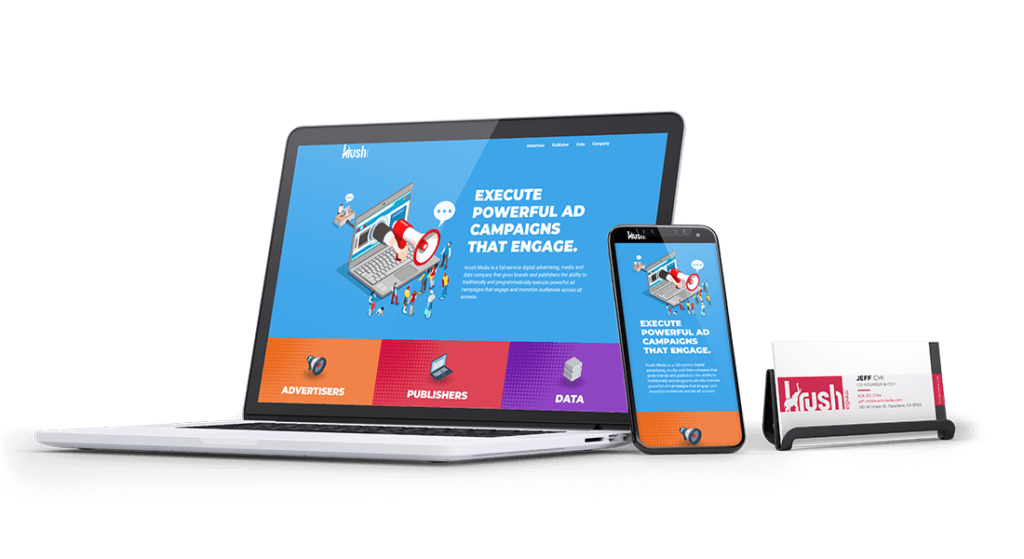
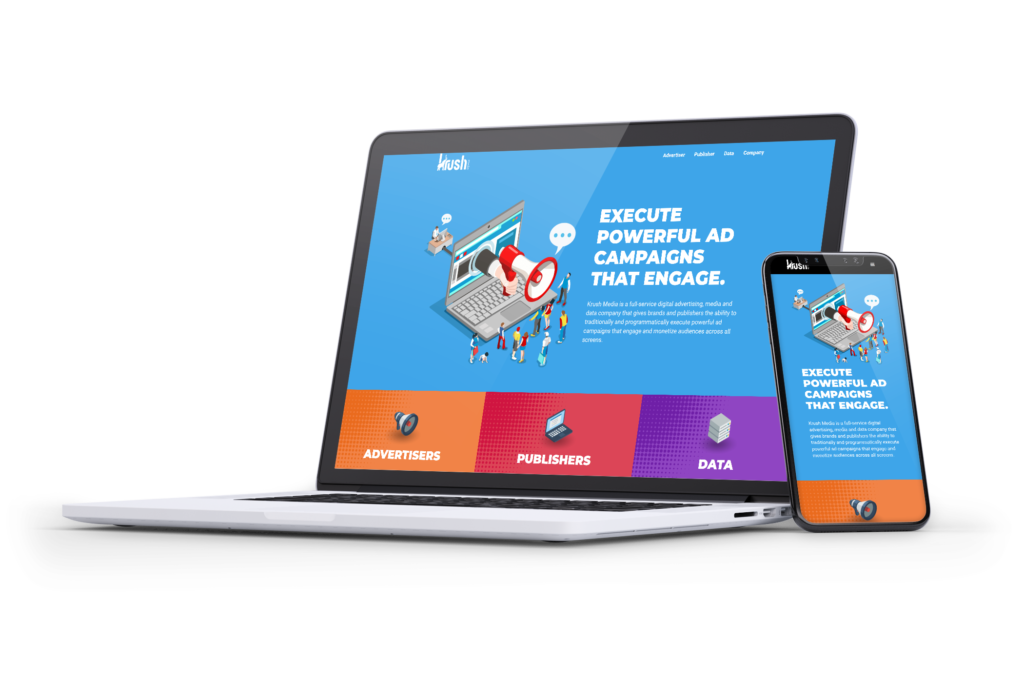
Krush Media is a recent spin-off from Krush Technologies – an app development company with titles like ooVoo and Flinch. Krush Media’s new focus is on direct publisher relationships and leveraging data to improve advertiser metrics. Their programmatic technology and targeted audience capabilities is why we are proud to partner with Krush Media. Our goal was to take a different approach to traditional data and advertiser focused websites and make Krush bright, fun, and memorable. Many programmatic and traditional display sites use stock imagery to represent their products. Point A Solutions wanted to shake it up using isometric illustrations to give each product a unique scene. Coupled with a unique color each product and service becomes immediately recognizable. As Krush Media grows, Point A Solutions will introduce additional lead generating channels like live chat, and one-click consultation services.
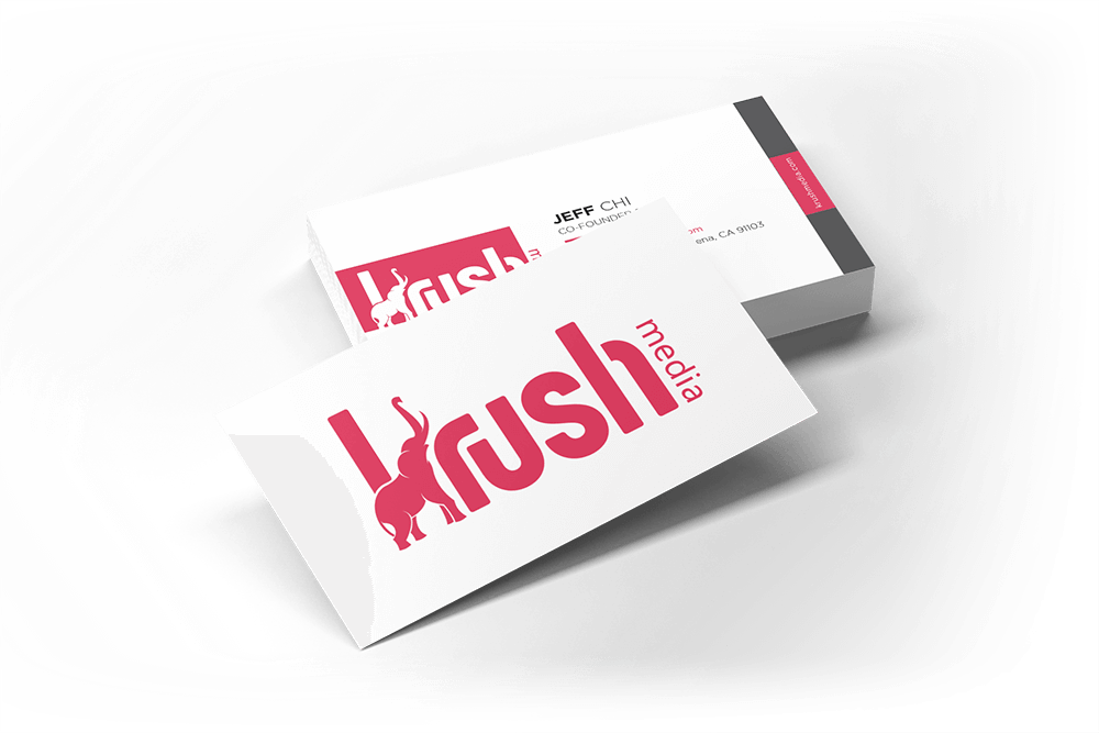
As part of Krush Media’s re-brand, we created business cards for the entire team. Point A Solutions focused on the new logo for the front and back, tying in the aggressive red, and leaving plenty of white space so clients can write notes. We also created marketing one-sheets for various ad campaigns and promotions.
Branding
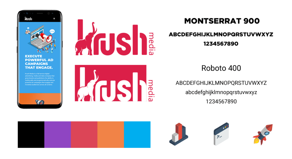
Krush Media needed a brand as big and bold as their name suggests. Krush came to Point A wanting to stand out from the traditional programmatic agencies looking for a different look than their previous brand in Krush Technologies. We chose an elephant to represent the Krush brand. With an imposing physical presence and kind, spiritual demeanor, it moves easily through life where few barriers can hold it back. Elephants are highly intelligent, emotional, and caring animals. They never forget, paint images, balance on balls and have the sheer size to KRUSH the competition. It symbolizes the care Krush puts into every client and intelligence of our data. The colors and fonts also had to be bold and rich. Montserrat fit perfectly. Each color represents one of Krush’s products. The blue is the company overall color, orange is advertisers, red is publisher, and purple is data. In effort to gain interests, the images and icons are all isometric illustrations.
